
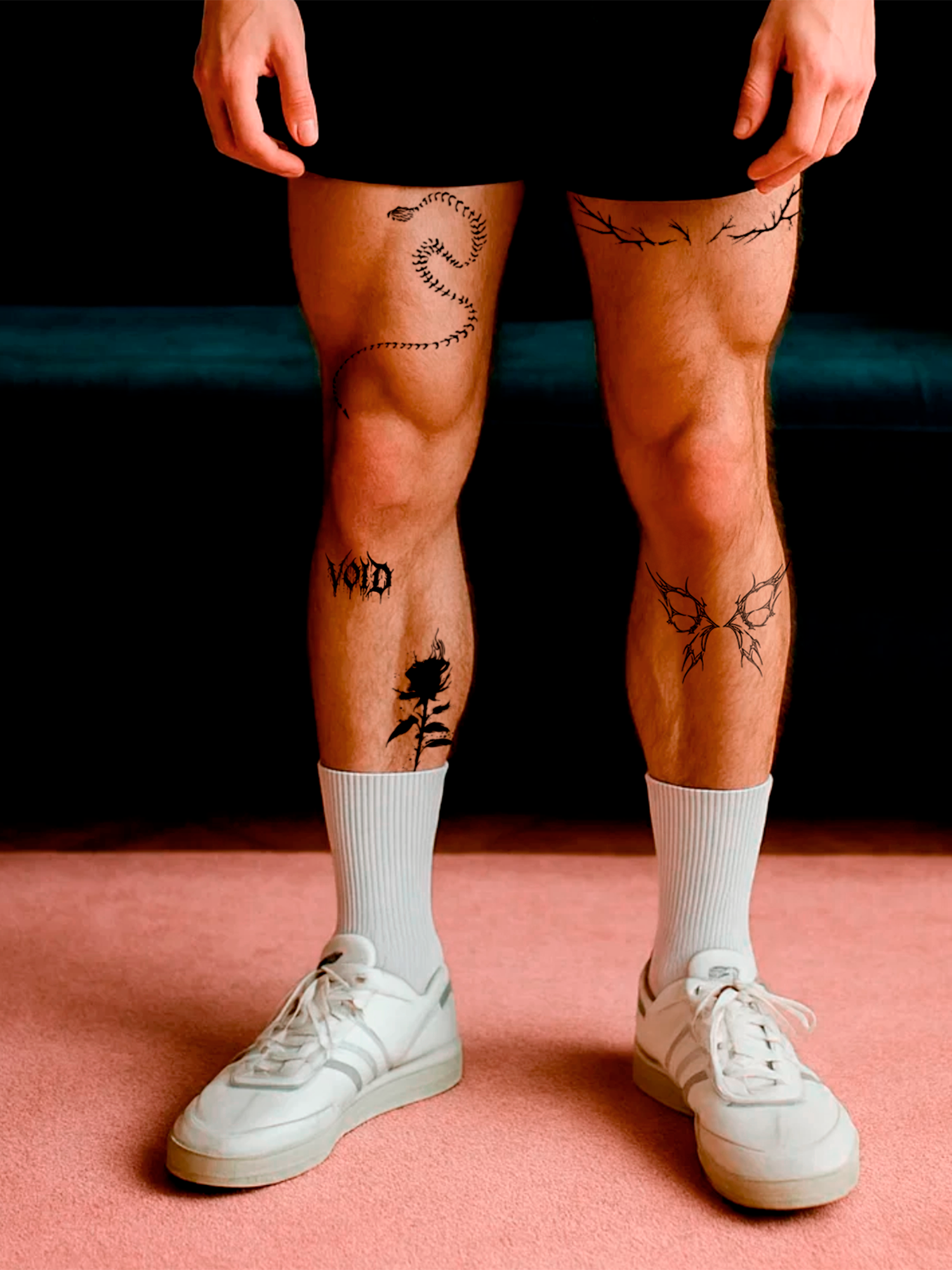
Lettering
Tattoo Fonts: Which Lettering Styles Work on Skin – and Which Don’t
 By Heidi
Updated
3 min read
By Heidi
Updated
3 min read

In short
Good tattoo fonts stay readable when the skin moves: clear letter shapes, enough space between letters and lines that are not too thin. Script and fine-line serif fonts look elegant, gothic lettering looks bold, typewriter fonts look minimal. The smaller the text, the simpler the font should be – and you can test any lettering as a 2-week tattoo before it is permanent.
A name, a date, one word that means everything – lettering tattoos are some of the most popular designs there are. They are also the designs people regret most often when the font does not work on skin. Here is how to choose a tattoo font that stays readable, fits your body part and still looks like you.
Which tattoo font styles are there?
| Style | Looks | Works best for | Watch out |
|---|---|---|---|
| Script / cursive | Elegant, flowing, personal | Names, quotes, collarbone, ribs, forearm | Loops close up when too small |
| Fine line serif | Delicate, classic, editorial | Single words, dates, small placements | Needs enough size for thin serifs |
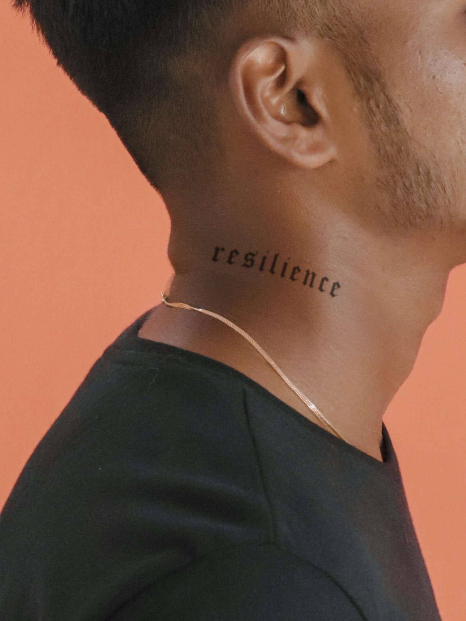
| Gothic / blackletter | Bold, dark, statement | Short words, chest, stomach, back | Hard to read in long sentences |
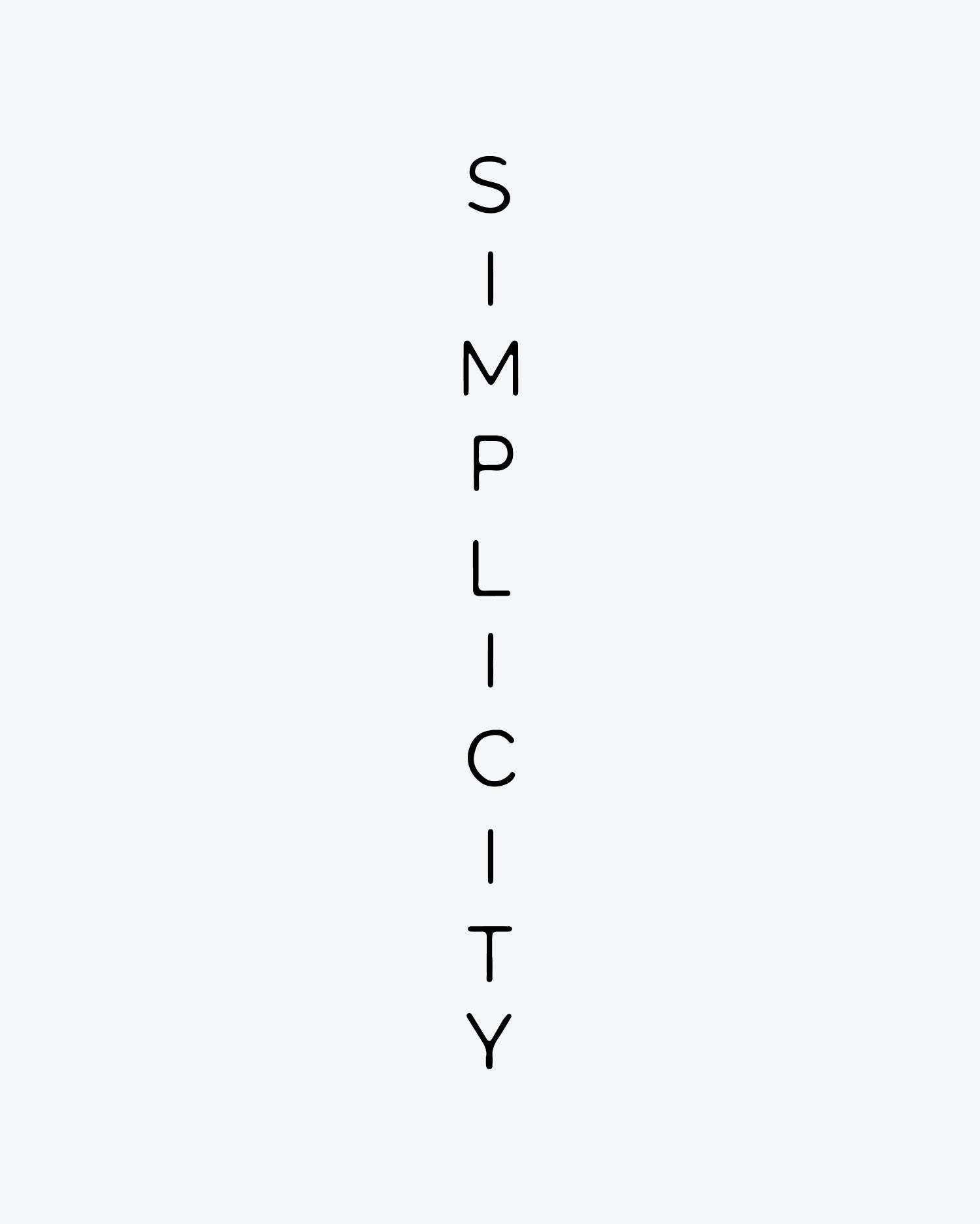
| Typewriter | Minimal, honest, modern | Dates, coordinates, short phrases | Can look plain if too small |
| Handwriting | The most personal | Notes from loved ones, signatures | Scan in high resolution |
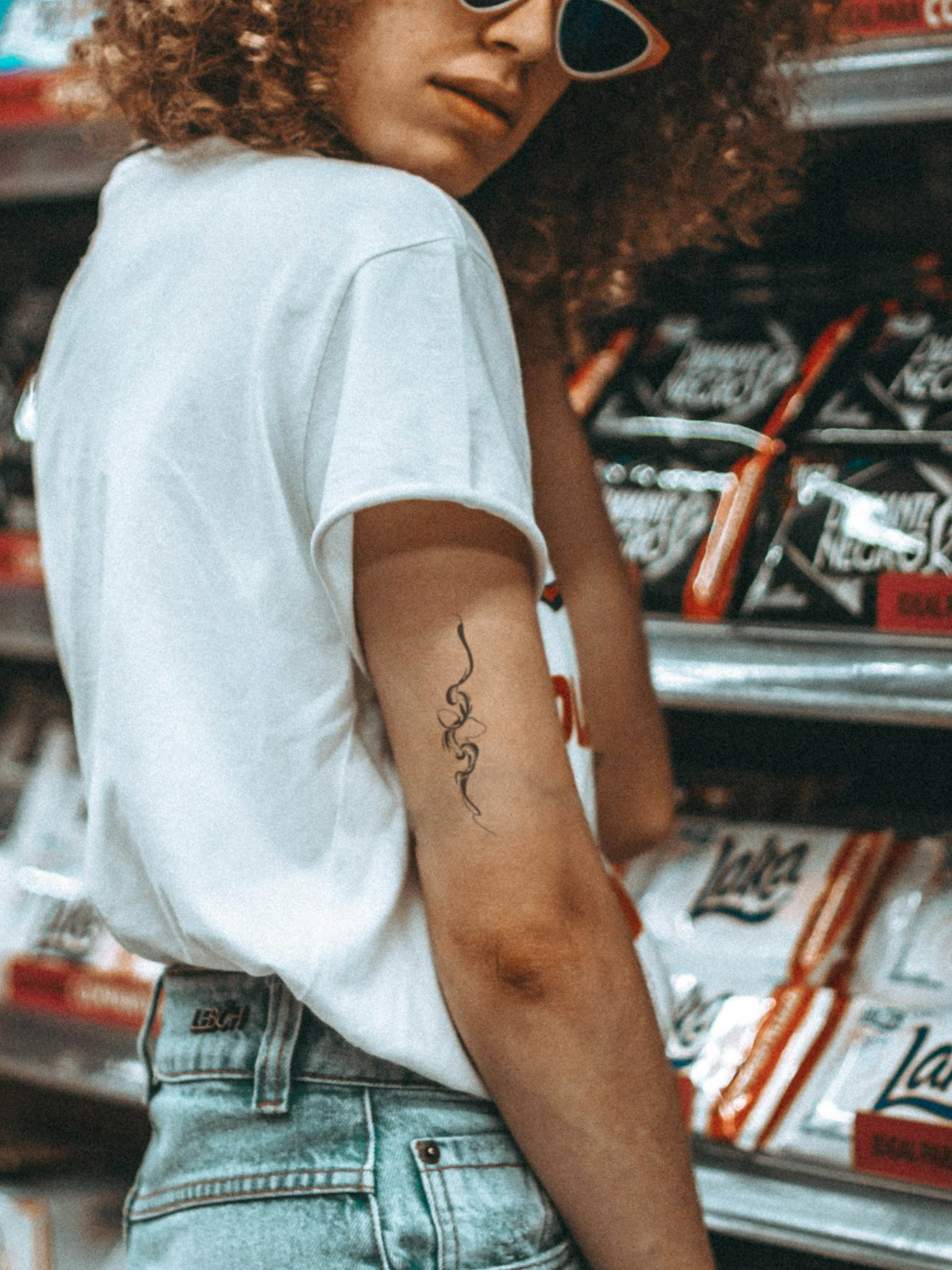
| Asemic script | Abstract writing without meaning | Armbands, spines, artistic pieces | Nobody can read it – that is the point |


What makes a font readable on skin?
- Open letter shapes: loops in e, a and o must stay open. If they close, the word turns into a line.
- Enough spacing: letters that almost touch on paper merge on skin.
- Line weight: very thin hairlines look great on screen but get lost on skin. For your own designs, lines should be at least 0.5 mm wide.
- Few words: one strong word beats a sentence. For quotes, choose a bigger placement.
How big should text be?
The rule of thumb: the more delicate the font, the bigger the text. A gothic word works small; a fine script needs room to breathe. Pick the size by body part:
| Body part | Good for | Font tip |
|---|---|---|
| Fingers, wrist | One short word, initials, a date | Simple, bold, no fine loops |
| Inner forearm | Words, names, short quotes | Almost any style |
| Collarbone, ribs | Quotes along the curve of the body | Script and fine line |
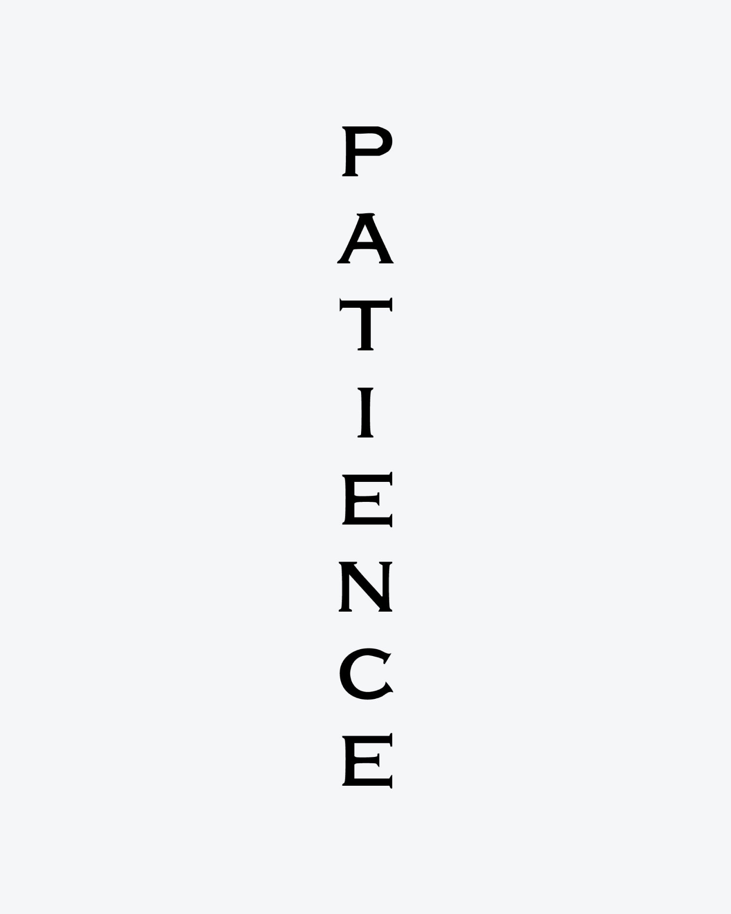
| Spine | Vertical words or a line of text | Narrow fonts, asemic script |
| Chest, back | Big statement lettering | Gothic and bold styles |
How do you design your own lettering tattoo?
In the Tattup customizer you type your text, pick a font from our curated selection and position it on your design canvas. You can use up to 2 text elements and up to 2 designs on one tattoo – a name plus a date, or a word next to a small symbol. You do not need to mirror anything: what you see is how it will look on your skin. Step by step in design your own 2-week tattoo.
HandwritingWant the handwriting of someone you love? Photograph it on white paper in good light, increase the contrast and upload it as a black and white image.
Which mistakes should you avoid?
- Not checking spelling. Especially in foreign languages. Ask a native speaker.
- Choosing on the screen only. Fonts look different on curved, moving skin.
- Too small for the font. Fine scripts need space.
- Too many fonts. One font per tattoo, two at most.
- Skipping the test. A lettering tattoo is easy to test: wear it for two weeks first – see try a tattoo before you get it.
Matching tattoos
View all


Frequently asked questions
Can I use multiple text elements in one design?
Where do I edit the text?
What types of designs work best?
Do I need to mirror my design before uploading?

Heidi is part of the team behind Tattup, the 2-week tattoo brand from Switzerland. We write about what we know from thousands of orders and our own tests – no hype, just facts.
Read next
-
 Design
Design Your Own 2-Week Tattoo: Step by Step From Idea to Skin
With the Tattup customizer you turn your own artwork, text or a sharp photo into a 2-week tattoo: choose a size and quantity, upload a black and white PNG or JPG, add ...
-
 Realistic look
Fake Tattoos That Look Real: 7 Things That Make the Difference
A fake tattoo looks real when the color sits in the skin instead of on it: matte, without a shiny film or edges, in dark blue to black like real ink, with fine, sharp ...
-
 Testing
Try a Tattoo Before You Get It: How to Test Design, Size and Placement
The best way to test a tattoo is to wear it: order your exact design as a 2-week tattoo in the size you are planning, put it exactly where it should go and live with i...


Ready for your first one?
Over 500 designs, dark blue to black on your skin, gone after 1–2 weeks.